Animation Production Diary – Short but nevertheless important

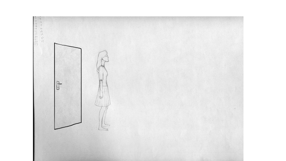
There are a few scenes dotted through the animatic that could be described as very short and scenes five and six would fall under that category, comprising a total of three seconds all together. Scene five is a simple step into the ‘ghost room’ and scene six follows it up with a short glance up from our protagonist as she spots the ghosts.

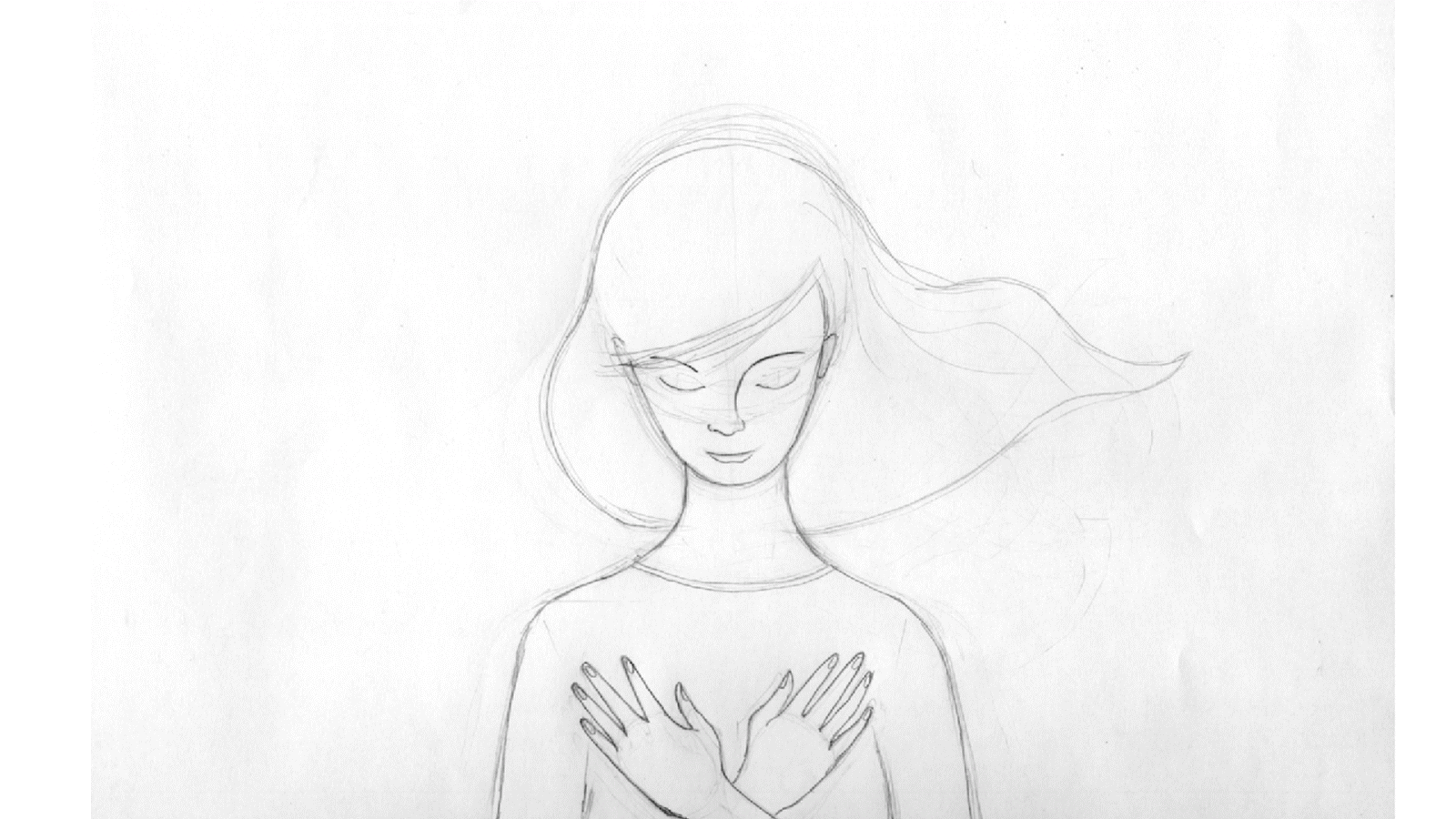
While short they are important, scene six bridges the story from the frantic run that preceded it to the more serene atmosphere of the ‘ghost room’. I felt it important to have her step even once, rather than just have a more easily completed hold, to represent the dissipation of energy from the mad dash.

One small step for the Melancholic Wife…

The glance upwards then has to communicate an emotional shift, I wanted to portray a graceful arc to her movement and emphasise the flow of her hair to preface the floating light tone of the dancing ghosts who are about to appear on screen. I learned the importance here of not underestimating any scene no matter the length and its potential to keep a story continuum on track.

This scene is also the first and only real close-up of the character so I really wanted to communicate her poise and character as much as possible.

Professional Development Logos

The final version of my designed logo, trying to communicate on both a strong graphic front with the block colour pen and an illustrative front with the line-work portrait. The integration of pen and portrait came from research into Saul Bass design and his imaginative and clear use of graphic elements interacting with one another in unusual ways.

Animation Production Diary – They need to look like a woman’s hands

The action in scene ten involves a close up of the Melancholic Wife reaching up to try and bring a ghost with her as she is being pulled down. The ghost represents a positive memory of her teenage self, an instance not weighted down by the same troubles as her adult self, and the effort to carry it with her into the darkness is an attempt to accept this positive aspect fully into herself. As such I feel the movement needs to be gentle, soft and kind. She is not grabbing the ghost, she moves to embrace it and ask for her help.

For reference I took a video of my own hands but of course they need to look like a woman’s hands so the theme of this scene was softness all round.

Hands
Ghost
Both together

Animation Production Diary – The wind in her hair

Scene twenty two of the film,  the calm after the pyrotechnic storm was another scene I choose to tackle early. The Melancholic Wife’s torso is stationary for the most part so it represented an opportunity to focus on animating a wave, a fundamental animation principle, in her hair. The flow of the movement is also a first exploration of animation timing for the film. I was able to achieve a balanced flow in the animatic and it is my hope and intention to carry this over as much as possible into the animated movement.

Animation Production Diary – Pulling the rug out from under

I decided early on to try and complete scene three from the animatic to inked stage ready for comping. I thought that this would support me to understood the process from start to finish as much as possible before beginning full production. The scene is about twenty seconds long as well so would represent a fair chunk of completed work. It also contains aspects of background, animation and pre-compositing.

The animation I’m sharing below is the follow up to the carpet growth, two arms reach across and pull the grown carpet up. In animating it my pre-occupation was to communicate the tension in the carpet as it’s pulled up, the carpet fights back against the force of the hands until finally being ripped wholesale from the screen.

Personal Brand Identity Development

Further development of the business card focusing on the strength of the illustration image on its own with the underlying grid of rectangular shapes speaking to my work in comic books and delivering colour information.

Possible logo and letterhead designs, I hand lettered the typography based on a font from the IM Fell Types class of fonts.

Business Card Concepts

I have been working up some different concepts for my business card.

This is my previous card and I like the duality element conveyed by the mirrored faces, it illustrates for me the different roles that I can inhabit as an artist. So I would like to retain some element of this while bringing in an indicator of the new reality of pursuing animation roles. The image gives a sense of my style as an illustrator but does not indicate an idea of animation. 
When talking to John Sherwin he recommended exploring the use of colour, hand lettering and emphasising the style that my work contains.
Here are a few samples.