Professional Development – Business Card

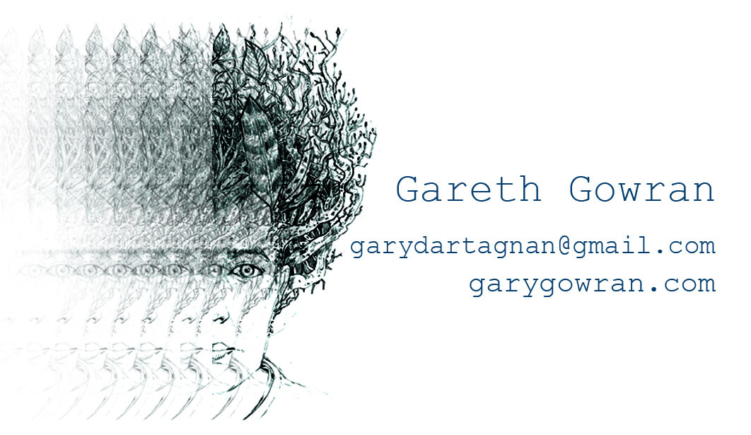
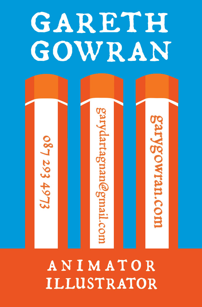
The finalised designs for the front and back of my business card. The front is my logo without the font elements communicating something of my personality. the back holds the information matter and I decided to go for a very strong graphic approach as a contrast to the illustrative dominance of the front. This is an attempt to convey something of the breadth of my experience. I also felt strongly about including the drawing utensils of pen and pencils in some way to give a nod to the fact that I still use these tools as part of my process on a daily basis.

Professional Development Logos

The final version of my designed logo, trying to communicate on both a strong graphic front with the block colour pen and an illustrative front with the line-work portrait. The integration of pen and portrait came from research into Saul Bass design and his imaginative and clear use of graphic elements interacting with one another in unusual ways.

Business Card Concepts

I have been working up some different concepts for my business card.

This is my previous card and I like the duality element conveyed by the mirrored faces, it illustrates for me the different roles that I can inhabit as an artist. So I would like to retain some element of this while bringing in an indicator of the new reality of pursuing animation roles. The image gives a sense of my style as an illustrator but does not indicate an idea of animation. 
When talking to John Sherwin he recommended exploring the use of colour, hand lettering and emphasising the style that my work contains.
Here are a few samples.