Peter McVerry Trust Logo

For the end of the film we decided to transition to the Trust’s logo from the previous scene’s frame arrangement.

We decided to stay in keeping with the paper aesthetic of the film so I recreated the logo using the digital paper effects applied previously to the page layouts.

Compositing the disparate elements

I took on the job of overall compositing of the different elements of the film. The challenge here lies in merging the live action material with the digital assets to create the impression that they both exist in the same space.

As well as the practical integration I also wanted to create a nostalgic feeling through the lighting and tone. I imagined Dwayne would be looking through this book in the corner of his room under soft lamplight. It is a treasured book, an heirloom.

I attempted to achieve this look through a combination of blending modes and shadow maps on the digital pages. On moving into after effects I experimented with the match grain effect, the tint and the fast blur effect. Through a combination of these effects the digital assets began to feel grounded with the live action.

Final scene layout

One of the decisions we came to as a group was to create the final scene entirely in cut out with minimal digital elements. Emotionally and aesthetically this felt like a strong tone to end on. Stop motion animation of Dwayne’s real paper hands picking up a real image of his daughter and it being placed on a real background depicting a wall of pictures in his new home. It felt more authentic to portray this in a tangible way. I used the wallpaper from the autumn scene internal frame and cut a series of frames to overall depict a house silhouette which would transition into the Peter McVerry Trust house logo. I added a small oval frame above the door with a photo of the key from the front of the album. The images in the other frames are the only digital element in the scene.

Book footage background

It was important to choose a neutral background which wouldn’t distract from the action taking place in the book. So white was the natural choice but it was also important to retain a sense of connection stylistically with the rest of the look of the elements. So I chose one of the patterned papers we had found. I feel that this supports the action while also bearing a good relationship with an underlying nature theme that has emerged due to the elegant fibres in the paper.

In order to maintain the lighting from the book footage I used a difference blending option on a light blue layer over the background. I then placed an image of the scanned textured paper over that in a dependent layer.

Animating Snow

One of my animation tasks on this project was to animate the snow effect on the winter page. For this I created a snowball PNG file with paper texture and drop shadow added and brought this along with the page background into Adobe After Effects. I used the CC Snowfall particle effect in this program and generated a simulation of snowfall, remembering to place the photo frame and Dwayne on a higher level so that the effect would pass behind the picture.

Book stop-motion

We shot the book before the Christmas break and I’m happy to say that the wire technique worked out. We were able to manipulate the pages into position and they held without any need for outside support. Due to the book not being traditionally bound some pages went a bit off-centre while lying flat. This has the advantage though of communicating age and that sense of Dwayne carrying the book with him through his life. I added corner registration marks to aid the compositing of the digital elements onto the footage.

Book footage.

Digital Page Layouts

The pages of the album follow a seasonal theme, there are four pages for the four seasons and the four stages of the journey that Dwayne describes. The album begins in summer with the first page illustrating Dwayne leaving the hostel. The animation will be occurring inside the frame so I was free to fill the outside with decorative features, bearing in mind that I would have to be prepared to let some of the details go if they took away from the animation.

Summer page.
The next page is autumnal in tone. The goal here was to convey an abundant harvest, celebratory feel as Dwayne describes being able to have his family over for dinner in his new home. The film here cuts to a pan and the internal frame fills the screen so I felt freer to illustrate the external with some more minute details. These included leaves and acorns, fruit and tree roots. The internal frame has to act as a stage for the animation to play on so is less detailed. I attempted to convey a homely sense through the flowery wallpaper pattern. 
Autumn page.

Turning to the winter page, the colours change to cool blues and whites. The page design also turns more minimal. This hopefully communicates the starkness of the season as Dwayne describes being unable to have people over while living in the hostel. I added a wallpaper element to help emphasise the coldness but again with the caveat that if it interfered with the animation it would need to go. For this page the we are going to animate a snowstorm occurring outside the walls of the internal frame. This hopefully communicates the protection the hostel offers.

Winter page.


The last page is the spring page and the colour theme here is green. The main job for this page is to act as a stage for the cut-out animation which will occur. Paper hands will reach in to pick up the picture of Dwayne’s daughter and we will transition to the hands placing the picture on a wall of pictures in Dwayne’s home. This page has been made simpler than the concept as that seemed too busy when actually creating it digitally.
Spring page.


Dwayne’s Photo Album – Adventures in Bookbinding

We have decided to make a real book and shoot a stop motion animation of it to act as the stage for our pages. Further down the line this will require compositing with the digital pages. But first to make the book. Fortunately I have just recently completed a book binding course and while most of the binding techniques won’t be applicable, it has given me a grounding in the principles.

I decided to make the book A4 size as this would be the most manageable to deal with physically. Testing the page dimensions against a 16:9 ratio beforehand also let me know that it could work within a film context.

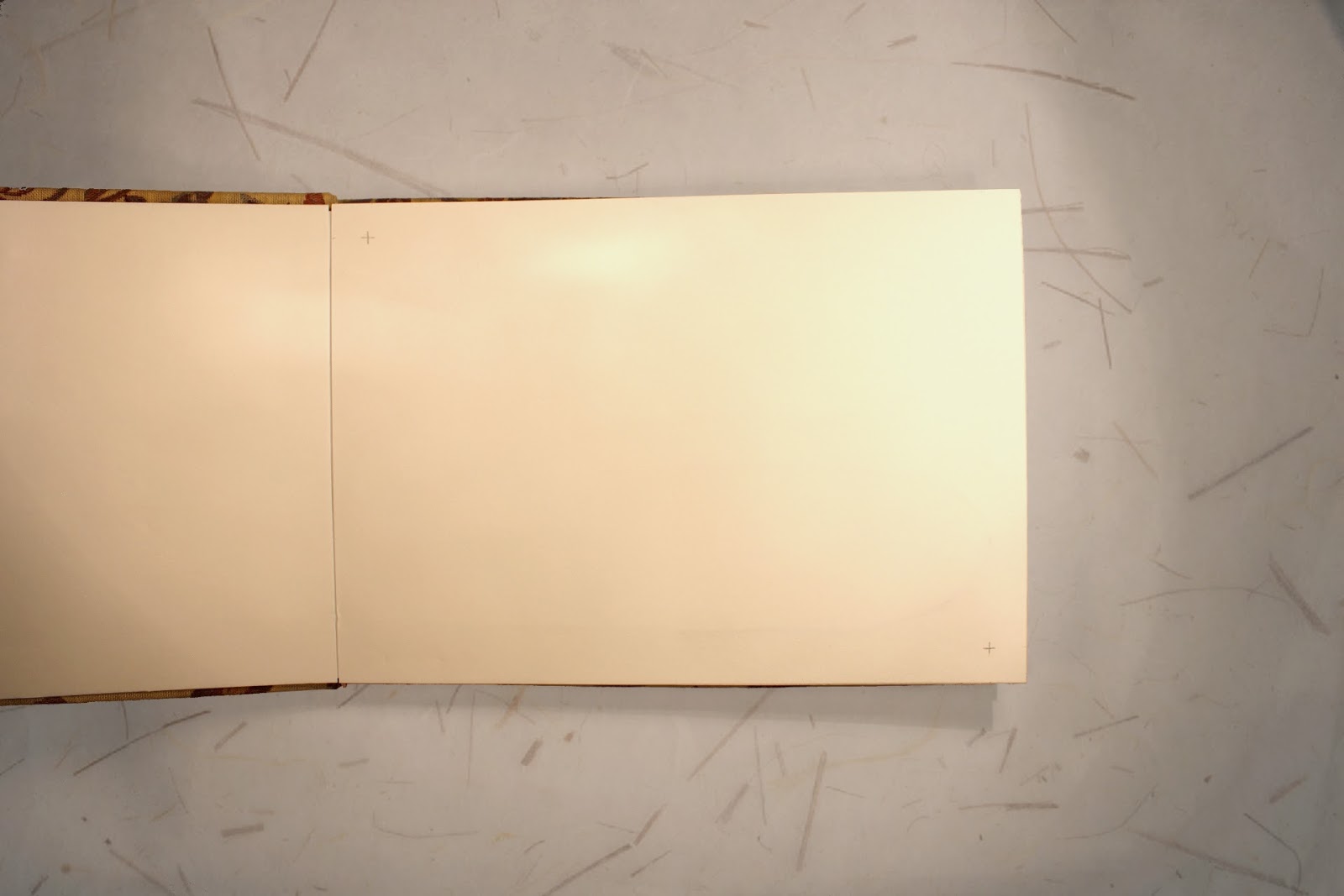
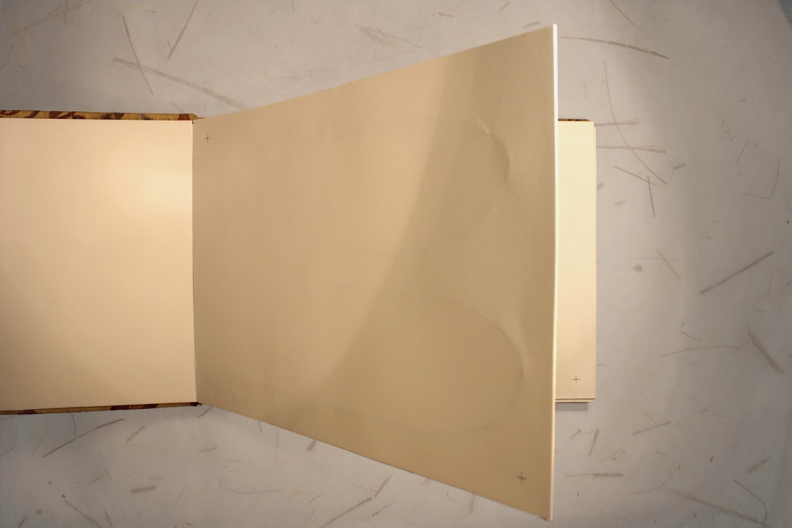
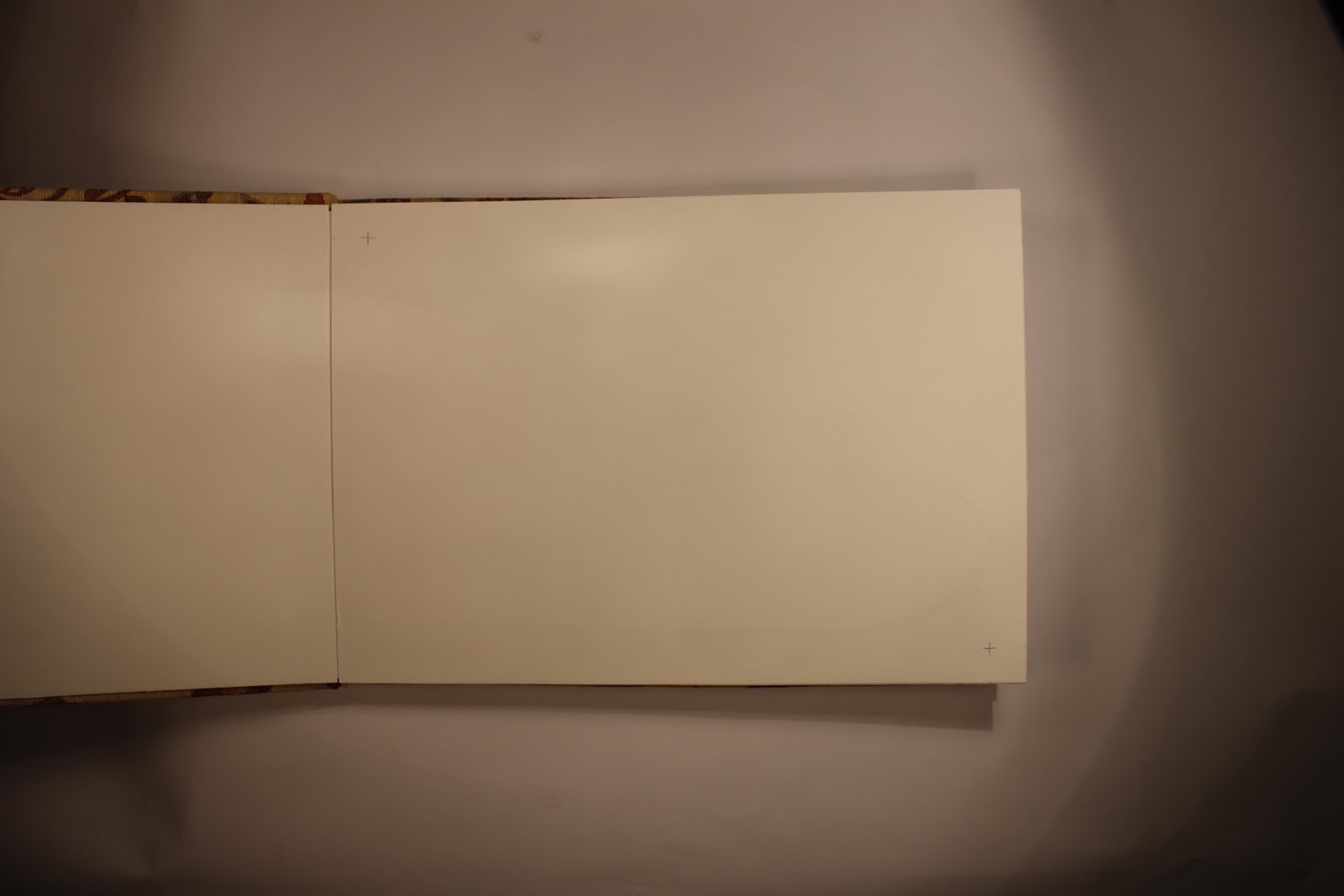
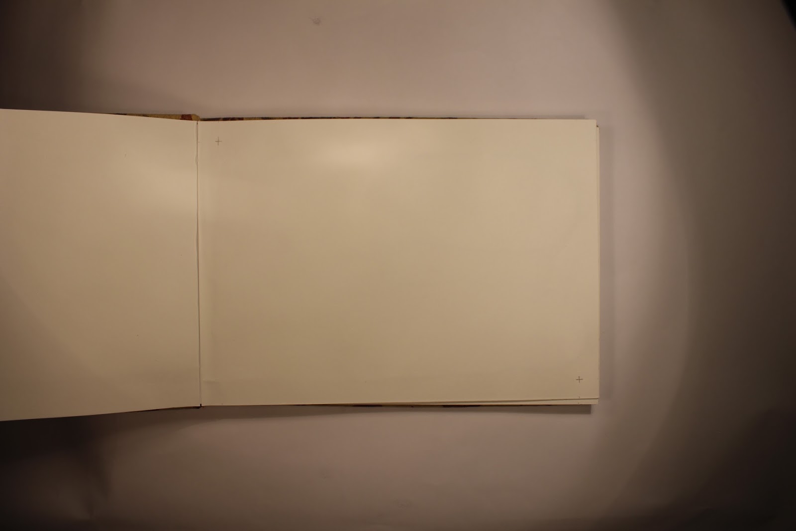
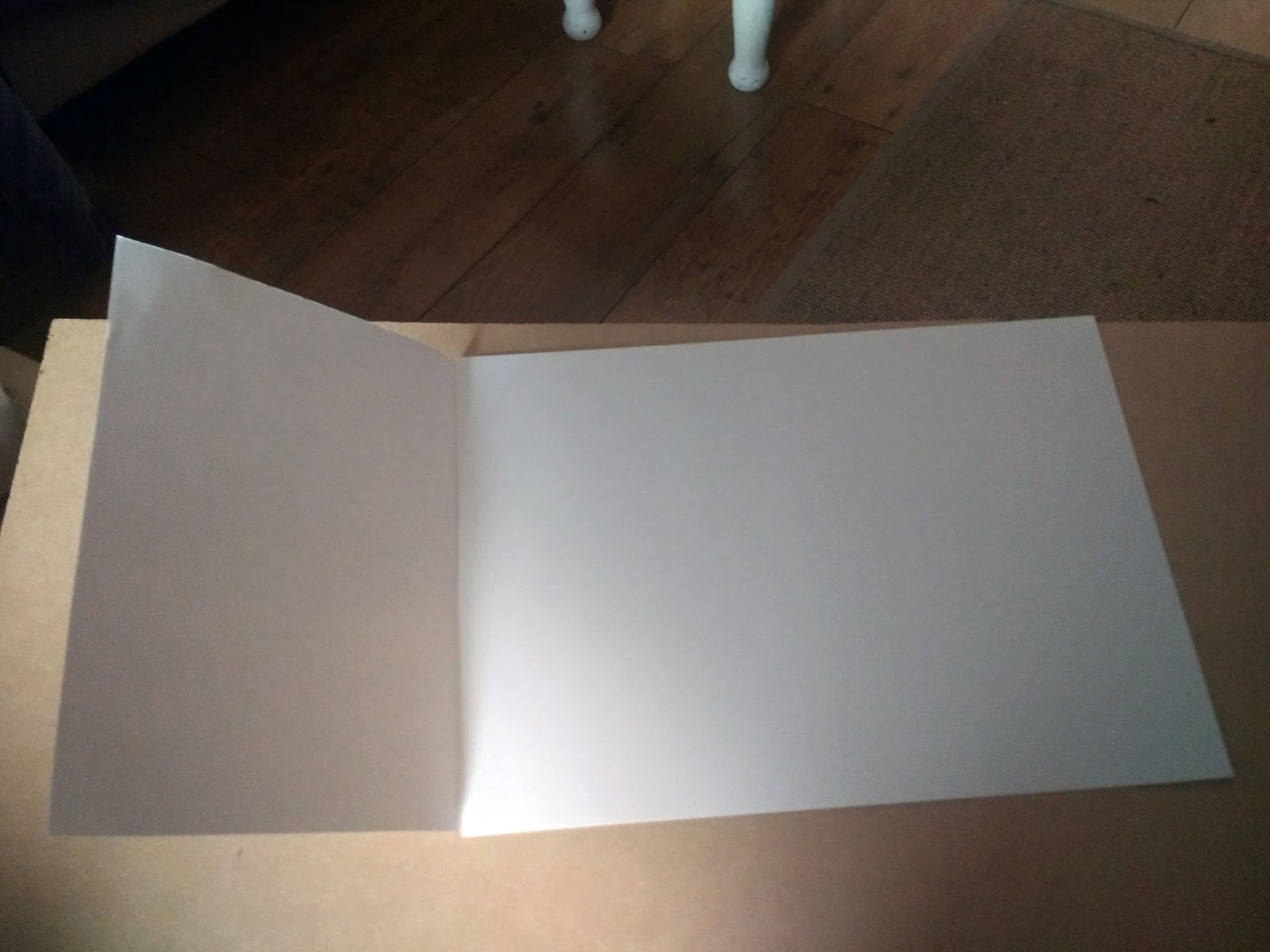
What I decided to do was to use quite a heavy grade card and sandwich wire loops between two sheets. I then glued these two sheets together to create essentially one page. I made the wire lengths long enough to be sandwiched between two of these ‘sheets’. This meant that when we went to turn the pages that half the wire would be embedded in the book which would enable the other half to have a solid foundation. This foundation would enable us to manipulate the wire.

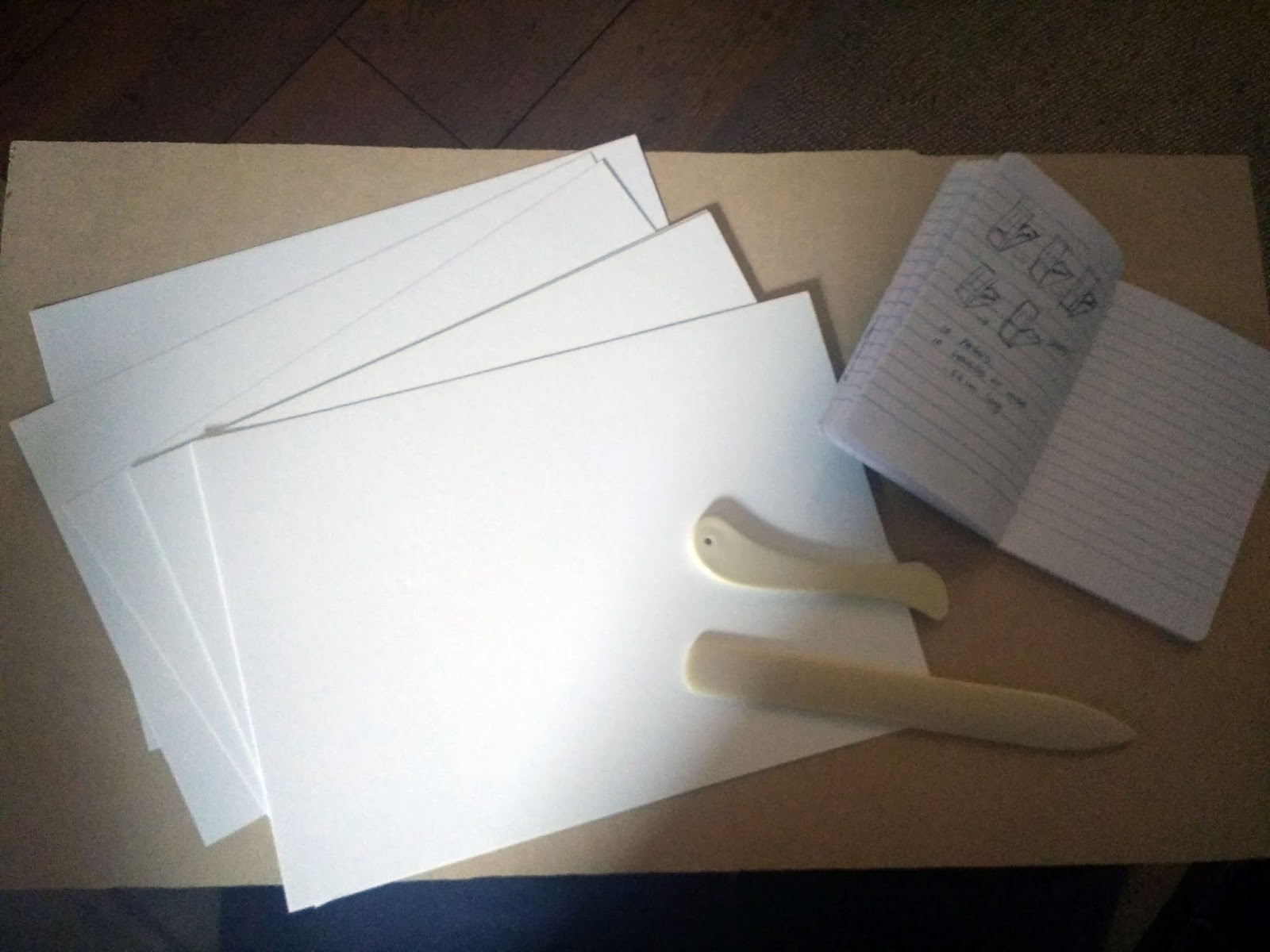
 Book pages and notes.

Creating the book.


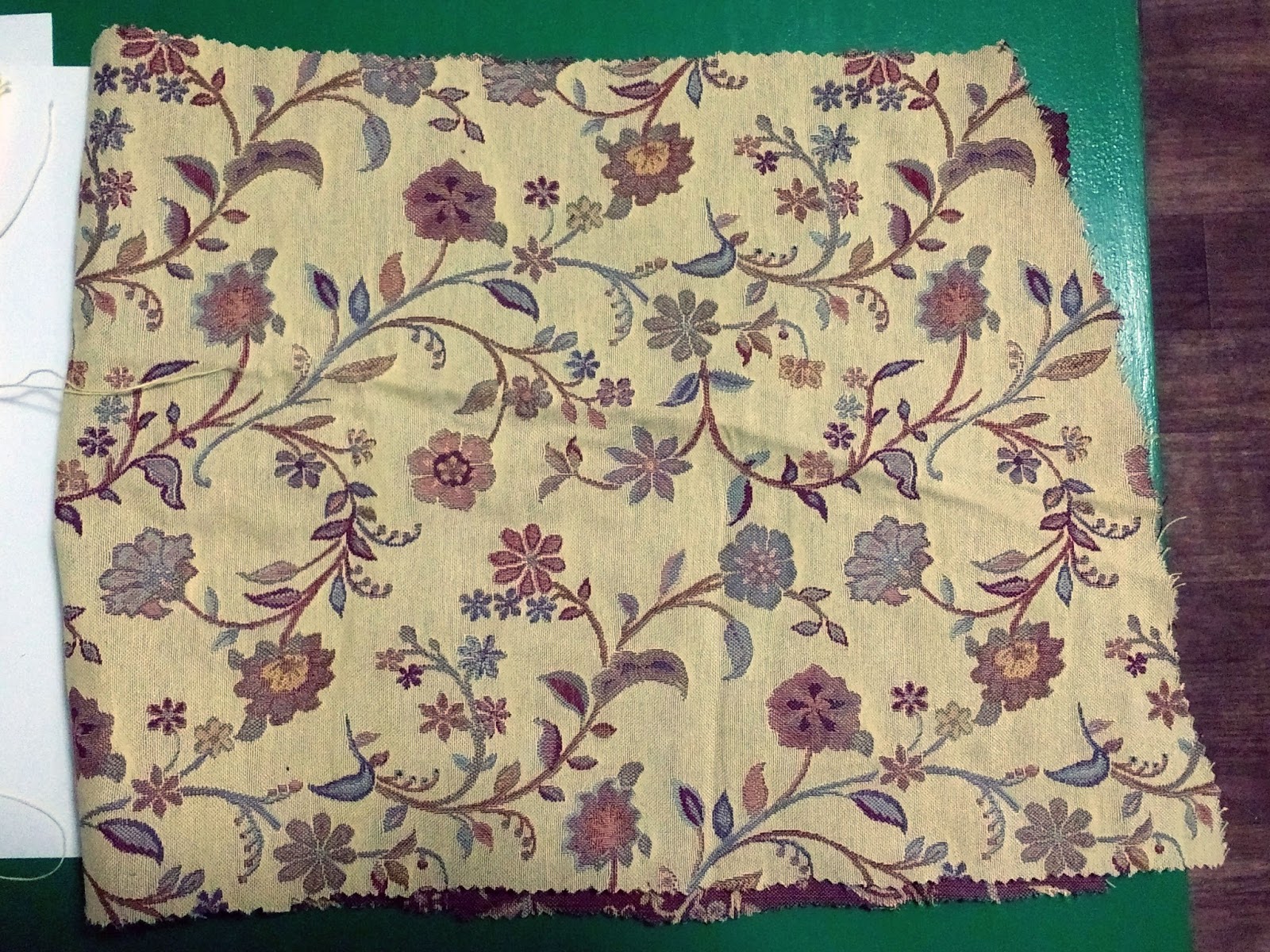
For the cover we decided to experiment with textiles. This could bring some interesting texture and add to the individuality of the piece. It came down to two;
Book cover textiles.
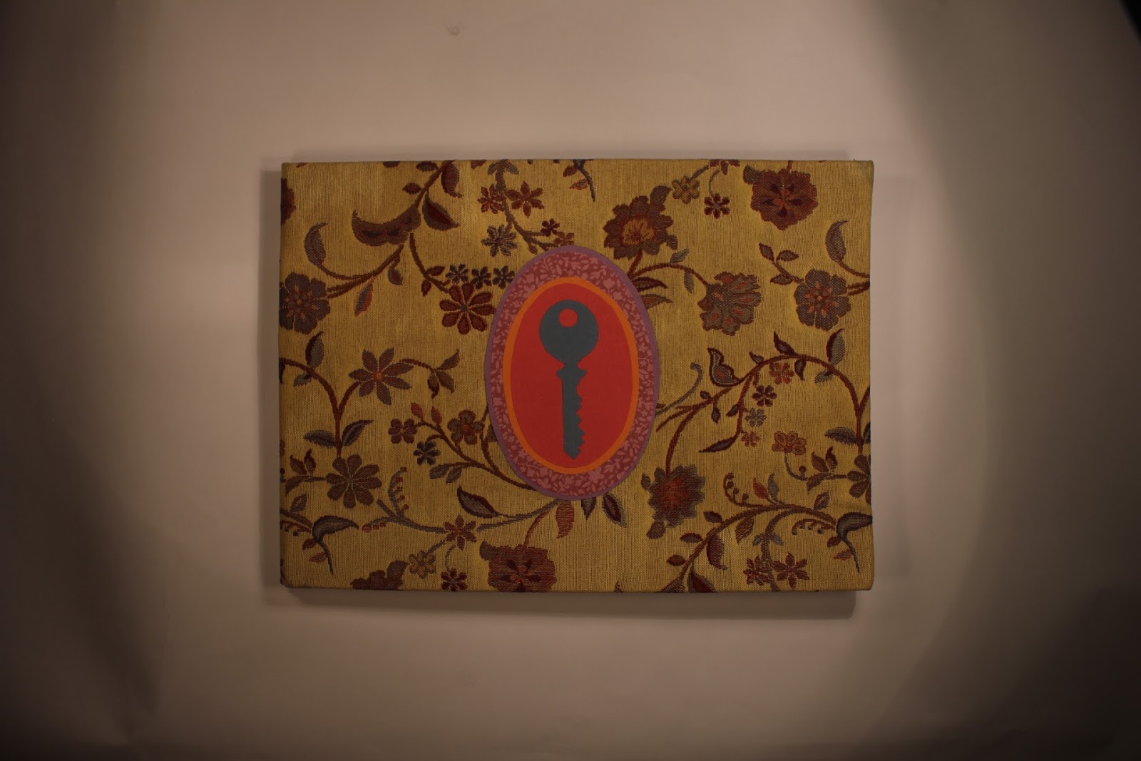
We decided to go with the floral pattern. we felt it tied in well with the overall theme of the book and contributed a more homely feel. It was the harder of the two to manipulate,being thick fabric, so a lot of compression was required after gluing it to very heavy card stock to ensure it stuck as firmly as possible.
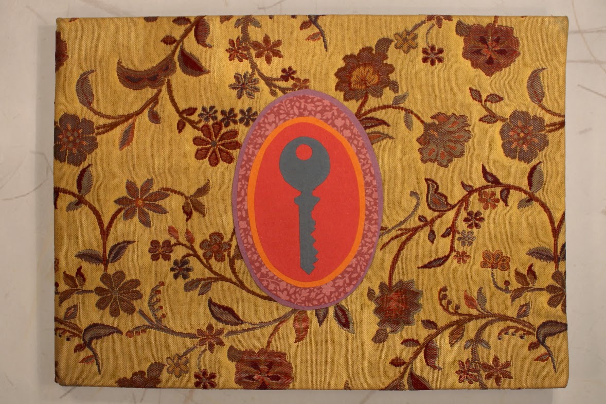
The next step was to finalise the emblem for the front of the book. In the storyboard a key as used as a central symbol on the cover, communicating access and an unlocking of a doorway into another’s experience. The power of the key as a totem of freedom and development feels strong with people afflicted by homelessness.
Key design ideas.


The final key design incorporates plain and patterned paper.
Final book cover.

Digital Background Textures

I am creating the photo album page backgrounds digitally using layer styles; pattern overlay techniques, this involves using scanned textures in imaging software and managing the noise levels, blending modes and opacity levels to create as realistic a paper look as possible; drop shadows, enabling the illusion of depth and a gap between ‘paper’ levels, again using blending modes, opacity and also distance and softness levels; inner shadows, using a screen blending mode instead of a multiply mode to help create the illusion of the edge of paper standing out, augmented again using opacity, distance and softness levels.

Snowfall.

We have selected and scanned a number of different paper textures and colours for use in creating the backgrounds, main characters and background characters.

Paper Textures.
We have decided on using different papers for different elements in the film. The backgrounds will use wallpaper textures, the main characters of Dwayne and his daughter will be textured with tissue paper and the background characters will use mulberry paper. This will hopefully make them distinct while related.