Pre-visualisations for the McVerry Trust film proposal. My idea is to use the concept of a photo album to illustrate the journey that Dwayne expresses in his words. The underlying idea behind the photo album is to signify the transitory nature of being homeless, the photos represent Dwayne’s memories and experiences and the fact that they have no permanent home, he must hold them in a portable vessel. The cover for the album has at its centre a key, our access to Dwayne’s experience.
The album cover with the key symbol as focus.
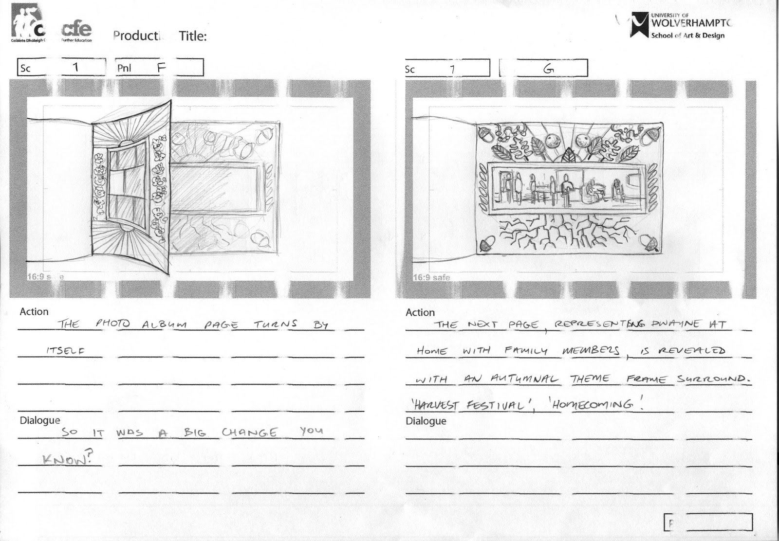
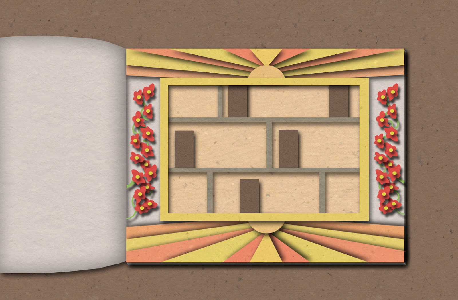
We travel through the pages of the album, each page with its accompanying photo and frame responding to Dwayne’s words. Dwayne has been in his home for a year so the frames are designed after the seasons beginning with;
- Summer – we see Dwayne in a hostel and he’s about to move out, the frame has sunshine as its main motif, flowers bloom as Dwayne leaves. The colours are yellow, gold and orange tones.
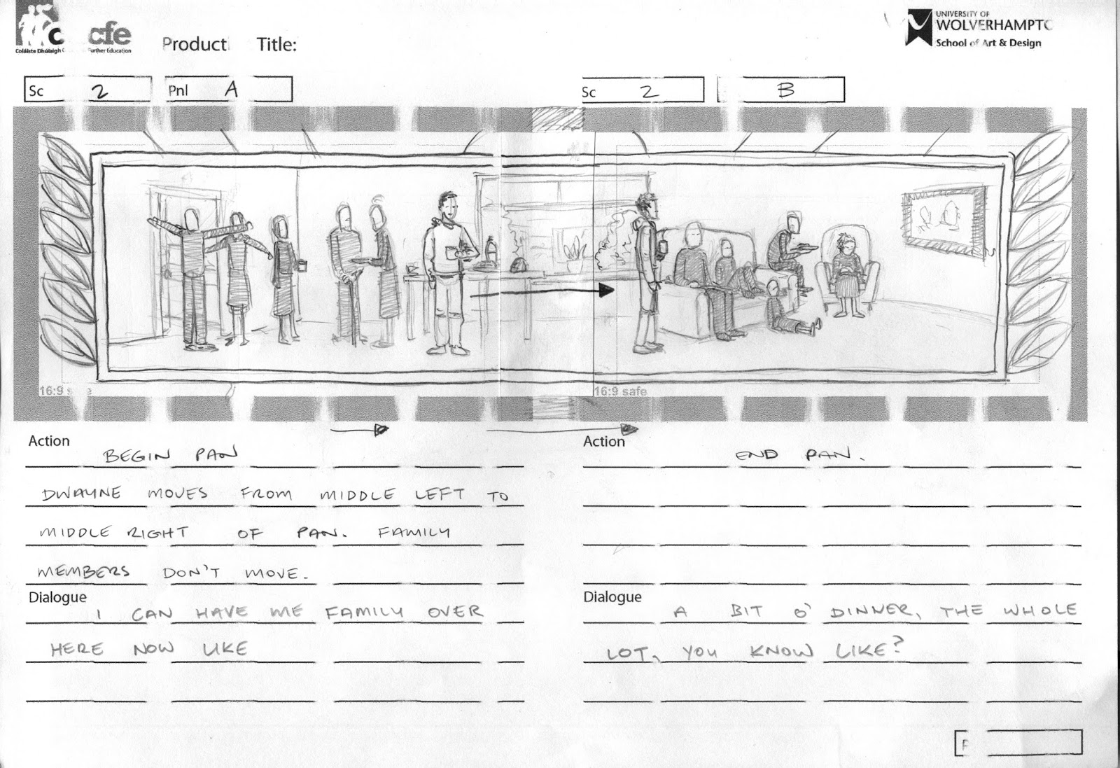
- Autumn – Dwayne is at home with his family. The frame embodies Autumn with a leaf and seed motif, a harvest festival feel, coming home. The colours are rust red, browns and muted greens.
- Winter – Dwayne reflects on not being able to have people over to visit in a hostel. The frame attempts to convey this isolation through the cold tones of winter. The colours are blues, pale whites and purples.
Winter page concept.
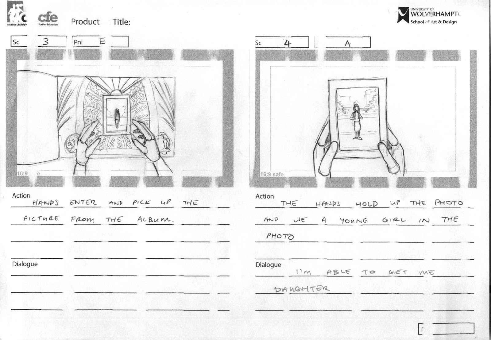
- Spring – Dwayne can have his daughter over to stay now, we see a picture of a young girl. The frame is flush with new growth, new possibilities, flowers and green leaves abound. The colours are vibrant greens and rich reds.
Dwayne then lifts the photo of the young girl from the album and we see him place it on a wall. He now has a permanent home for his life and his memories.