Dwayne Film Colour Palettes

For the group film, we have split the work for the production of the short into its different areas and agreed tasks between one another. This was greatly helped by the previously posted production maps. I have taken on the production of the digital backgrounds for each of the album pages. This involves the further development of the previous page concepts I posted including internal frame backgrounds.

For the colour scheme we have chosen jewel tone palettes.

Background palette. 
Dwayne palette.

McVerry Trust Production Design Concepts

Pre-visualisations for the McVerry Trust film proposal. My idea is to use the concept of a photo album to illustrate the journey that Dwayne expresses in his words. The underlying idea behind the photo album is to signify the transitory nature of being homeless, the photos represent Dwayne’s memories and experiences and the fact that they have no permanent home, he must hold them in a portable vessel. The cover for the album has at its centre a key, our access to Dwayne’s experience. 
The album cover with the key symbol as focus.
We travel through the pages of the album, each page with its accompanying photo and frame responding to Dwayne’s words. Dwayne has been in his home for a year so the frames are designed after the seasons beginning with;
  • Summer – we see Dwayne in a hostel and he’s about to move out, the frame has sunshine as its main motif, flowers bloom as Dwayne leaves. The colours are yellow, gold and orange tones.
  • Autumn – Dwayne is at home with his family. The frame embodies Autumn with a leaf and seed motif, a harvest festival feel, coming home. The colours are rust red, browns and muted greens.
  • Winter – Dwayne reflects on not being able to have people over to visit in a hostel. The frame attempts to convey this isolation through the cold tones of winter. The colours are blues, pale whites and purples.

Winter page concept.
  • Spring – Dwayne can have his daughter over to stay now, we see a picture of a young girl. The frame is flush with new growth, new possibilities, flowers and green leaves abound. The colours are vibrant greens and rich reds.
Dwayne then lifts the photo of the young girl from the album and we see him place it on a wall. He now has a permanent home for his life and his memories.

McVerry Trust Visual Reference

I’ve looked at a number of videos for inspiration in creating the short animation for the McVerry Trust with a focus on paper cut-out style animation.

Firstly I watched the short film The Thomas Beale Cipher. Which I found to be a great example of the use of texture, strong shapes and silhouettes in a cut out style. The characters are rotoscoped though which I wouldn’t be interested in exploring at this stage.

These have included the opening sequence to the motion picture version of A Series of Unfortunate Events.

For the action of turning the album pages, the end credit scene from the movie Up.

The opening sequence to the French film Le Petit Nicolas sparked the idea of creating cut out animation using a book/photo album as the stage.

McVerry Trust Film Treatment


McVerry Trust


Dwayne – Home for Good

Short Film treatment


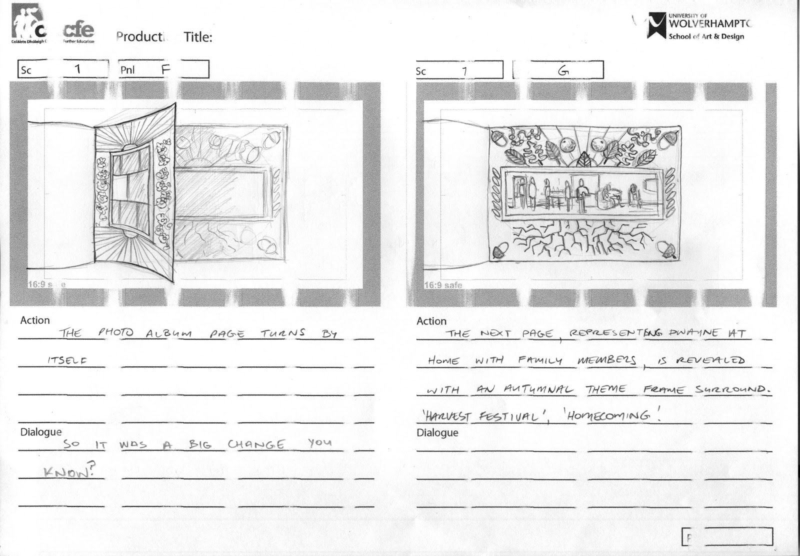
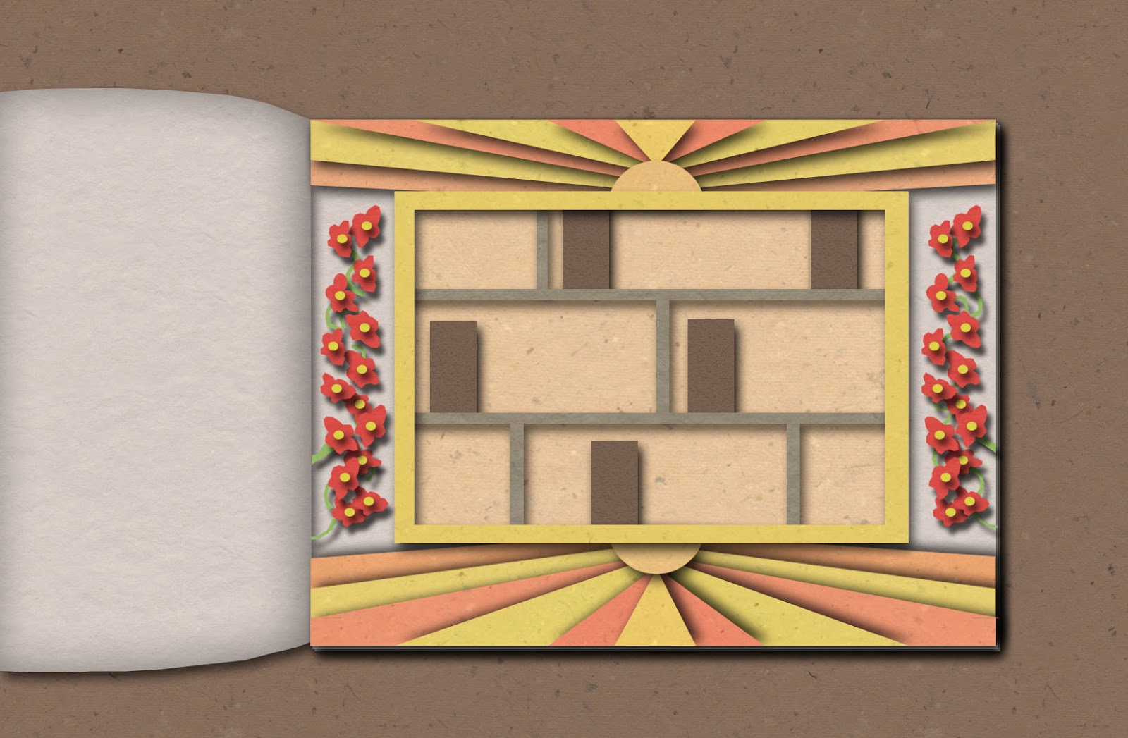
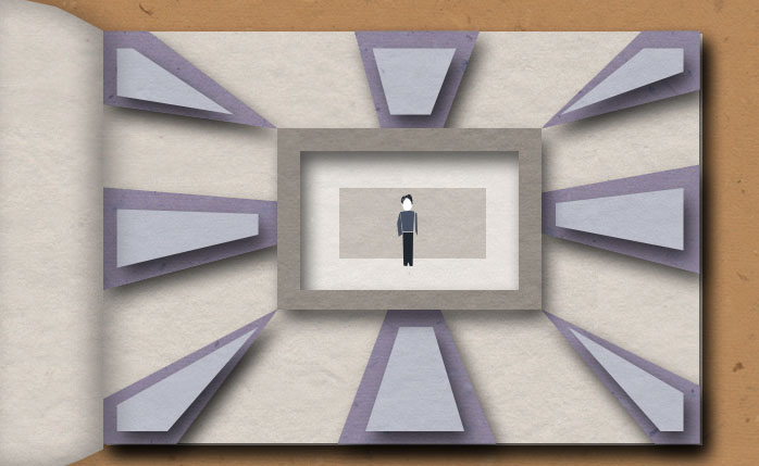
The screen fades in from black and we see a photo album sitting on a flat background. The front cover of the photo album is decorated in a key motif, an oval in the centre of the cover contains an illustration of a highly stylised key. A pattern radiates outwards from the oval in strips of warm colours to convey a sense of security and familiarity. The front cover of the album opens by itself to reveal a photo on the first page. Each photo in the album sits on its own page and has its own border evoking a physical picture frame.


‘I was in a hostel……..’
The first photo contains a cut away view inside a hostel, we see two floors of separate rooms in silhouette with a silhouette of a person moving around in each room. The silhouettes are all a single colour. The border of the photo is bright and summery, yellows and oranges, optimistic and hopeful.


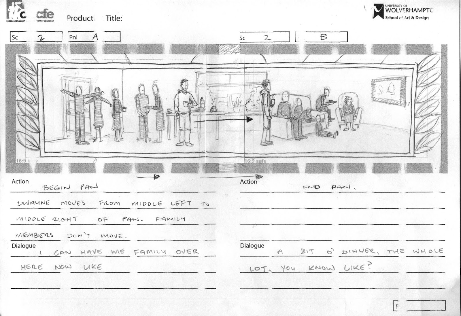
‘I can have my family over here now…’
The page turns and we see the next photo which is a panoramic view of a room filled with silhouettes of people standing and mingling over food and beverages. The silhouettes of the people in this photo are different colours, jewel tones or pastel shades. Dwayne stands in the middle of the room taking it all in. The photo border is autumnal in tone; gold, rust red and brown, harvest festival feeling, people gathering to celebrate the positive result of hard work.


‘Cause when you’re in hostels….you can’t have anyone over’
The page turns and the next photo just contains Dwayne by himself in a bare, sparse room. The photo border is cold blues and greys, evoking winter, isolation.


‘I’m able to get me daughter and bring her over…It means everything’
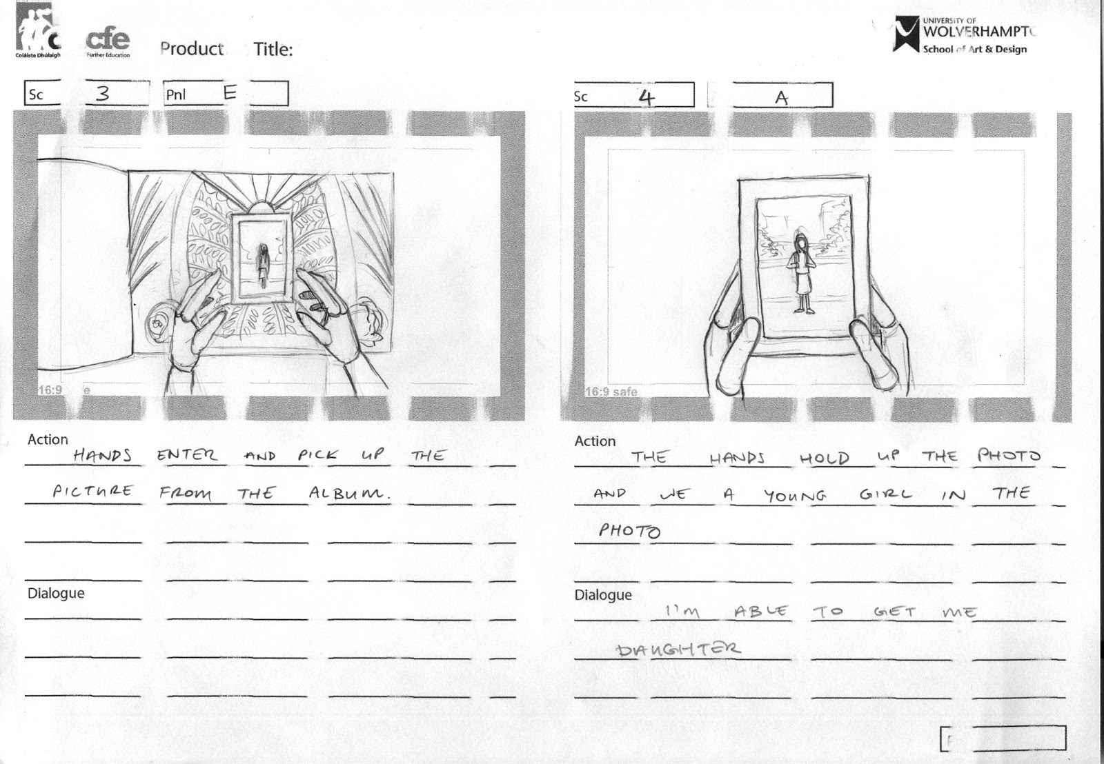
The page turns again and we see a photo of a young girl. The frame is vibrant greens, yellows and pinks. It’s springtime, time for growth. Hands reach down and pick the photo with its frame from the album page. We zoom out and we see it’s Dwayne, he has the photo in his hands and he reaches up and hangs it on a wall containing lots of photos of himself and his family. He places the photo of his daughter in the centre of the arrangement.

Fade out.