Background Colour Tests

With most of the film happening in a dream space, which exists in black and white, I am curious about the idea of bringing colour into the film when the Melancholic Wife returns to the ‘unromantic walls of her real life’. I created a few colour tone tests to acclimatize to the possibility.
 Blue tones

 Yellow tones

Green tones

Peter McVerry Trust Logo

For the end of the film we decided to transition to the Trust’s logo from the previous scene’s frame arrangement.

We decided to stay in keeping with the paper aesthetic of the film so I recreated the logo using the digital paper effects applied previously to the page layouts.

Animating Snow

One of my animation tasks on this project was to animate the snow effect on the winter page. For this I created a snowball PNG file with paper texture and drop shadow added and brought this along with the page background into Adobe After Effects. I used the CC Snowfall particle effect in this program and generated a simulation of snowfall, remembering to place the photo frame and Dwayne on a higher level so that the effect would pass behind the picture.

Digital Page Layouts

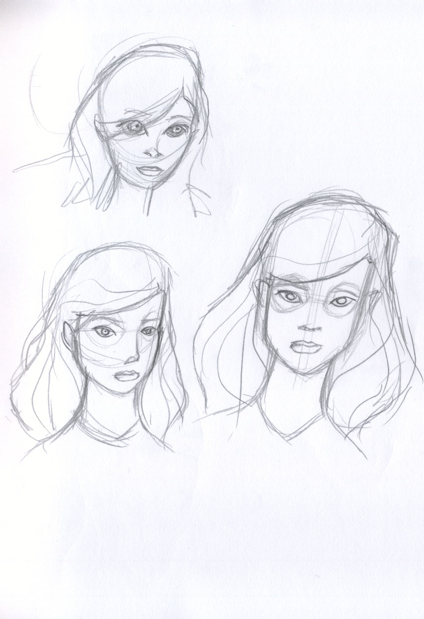
The pages of the album follow a seasonal theme, there are four pages for the four seasons and the four stages of the journey that Dwayne describes. The album begins in summer with the first page illustrating Dwayne leaving the hostel. The animation will be occurring inside the frame so I was free to fill the outside with decorative features, bearing in mind that I would have to be prepared to let some of the details go if they took away from the animation.

Summer page.
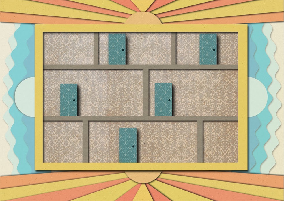
The next page is autumnal in tone. The goal here was to convey an abundant harvest, celebratory feel as Dwayne describes being able to have his family over for dinner in his new home. The film here cuts to a pan and the internal frame fills the screen so I felt freer to illustrate the external with some more minute details. These included leaves and acorns, fruit and tree roots. The internal frame has to act as a stage for the animation to play on so is less detailed. I attempted to convey a homely sense through the flowery wallpaper pattern. 
Autumn page.

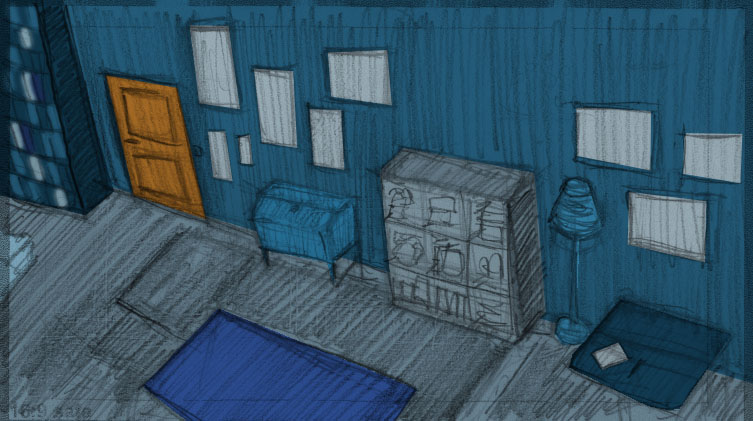
Turning to the winter page, the colours change to cool blues and whites. The page design also turns more minimal. This hopefully communicates the starkness of the season as Dwayne describes being unable to have people over while living in the hostel. I added a wallpaper element to help emphasise the coldness but again with the caveat that if it interfered with the animation it would need to go. For this page the we are going to animate a snowstorm occurring outside the walls of the internal frame. This hopefully communicates the protection the hostel offers.

Winter page.


The last page is the spring page and the colour theme here is green. The main job for this page is to act as a stage for the cut-out animation which will occur. Paper hands will reach in to pick up the picture of Dwayne’s daughter and we will transition to the hands placing the picture on a wall of pictures in Dwayne’s home. This page has been made simpler than the concept as that seemed too busy when actually creating it digitally.
Spring page.


Main Film Title

Trying to create a title for the film that represented its themes and complexity was a challenge. My initial thoughts were quite obvious with titles like The Dance, but this seemed quite on the nose. Brainstorming it resulted in some more nuanced ideas; Untethered Tread, playing with becoming lost in a memory through the sound of a footstep, and tread/thread; Tread and Temper, again referencing tread/thread, following a thread, unravelling with the alliteration of temper to evoke the emotional challenge; Soft Floor/Bare Boards, softness/toughness, flow between the two. The title that I hit on as seeming most evocative and descriptive was Sound Holds the Distance Travelled. Referring to the power of sound as the catalyst for the Melancholic Wife’s journey back into her memory and the temporal distance between her present and past self. The whole of this journey is held in the sound waves.

Alternative Opening Sequence

In trying to create an opening to the film I was conscious of wanting to represent the creative heritage from which the film has evolved. The themes and subject matter explored within the film began in a web-comic strip called Splitting Borders developed with my creative partner Sadhbh Lawlor. We made our own handmade books of these strips which brought a tactile element to the work. From there we moved to short stories, again making our own books from the work. The film now represents a deepening of the work and with this opening I wanted to make a nod to that lineage.

The opening consists of a montage of photographs displaying the physical artifacts of the previous work.

I’ve maintained the black and white aesthetic of the film in the opening to maintain a visual relationship between the two mediums of photographs and drawings.
For the transition into the main film the camera zooms into the notebook, representative of where the work begun, as written words on a page.